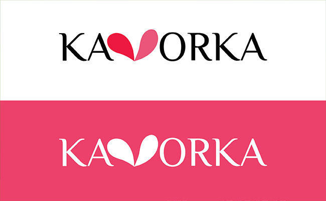
The first step of this project was to create a logo that embodied the brand’s concept of expression and sensuality. After considering several names, Kavorka was chosen for it meaning of attractiveness. Once the brand’s name was decided, my role was to aid and approve my project partner’s logo design. Multiple beauty brands were sources of inspiration for his design, such as Dove and Sephora. The Philosopher font was chosen for its balance of readability and elegance, and the letter “V” was replaced by a pink heart-shaped figure resembling lips. The final result was a sophisticated and feminine logo with an unique design that aligned with Kavorka’s values.
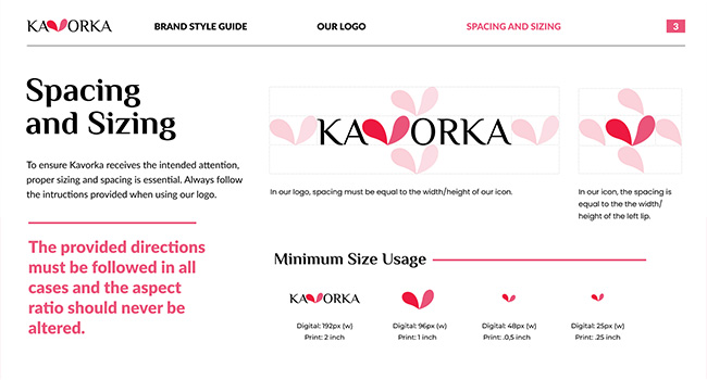
After the creation of a logo, the next step was to take the brand’s already established concept and create a design guidelines document in collaboration with my project partner. The document reinforced the brand’s values and contained rules for the brand’s logo, colours, typography and photography. Both the colours and font choices were tied to the brand’s core values, while the photography style was meant to be unique and inclusive, ensuring that Kavorka would appeal to a wide and diverse audience.
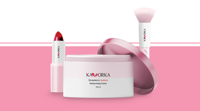
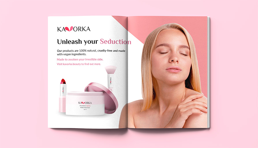
Once the design guidelines were completed, three products were created for the brand: a moisturizer, a make-up brush and a lipstick. Those products were chosen because together they offer variety to the brand. The packaging for those products was designed with simplicity and sophistication in mind as they were meant to be recognizable, but not overly flashy. Kavorka’s products were intended to be accessible, and so the packaging design reflected that.
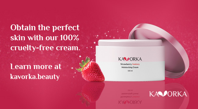
With the products and brand identity in hand, the next step was to design six banners and a magazine spread to promote the brand’s products and website. Both the magazine spread and banners highlighted the positive effects of using Kavorka and emphasized key features of the products, such as vegan ingredients or allergy-free formulas. The majority of them also displayed pictures of young and happy women to convey a positive feeling. an image
The result of this project was a beauty brand that successfully appealed to a wide audience of women and contained a good variety of products. The campaign was done in accordance with the brand’s guidelines and the video was complimented by many. All projects were completed ahead of the planned deadlines, which gave my team extra time to make any necessary adjustments.
Return to Home Page