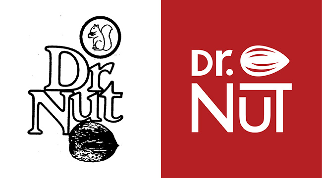
Redesigning the logo was the first step to establish Dr. Nut’s new design identity. Inspired by brands like Coca-Cola and Dr. Pepper, the logo was simplified and a sans-serif typeface was implemented. Certain elements were removed, but the nut and text structure remained to preserve the logo’s essence. The red colour, previously only present in packaging, became part of the brand’s primary colours along with white. The final result was a logo that was bold and modern but still felt familiar to Dr. Nut’s audience.
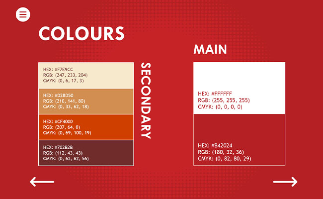
After the logo was finalized, the next step was to create the full design document of the brand on Adobe XD. The document required information about: the logo, spacing, sizing, typography, photography, iconography, grids. website sections and product cards. The choice of font was based on the typeface of the logo, and chosen colours were based on the logo and nuts of different kinds. The photography style choice was tied to the the brand’s mission and when it came to website sections, the goal was to create clean and easily navigable pages.
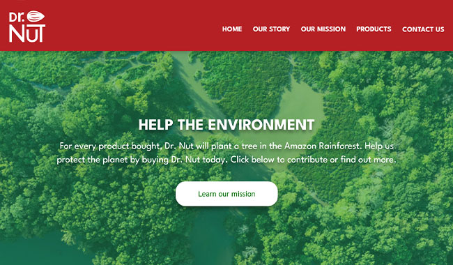
After the design guidelines were completed, the website was developed using only HTML, CSS, and JavaScript. The homepage was structured for easy navigation, redirecting users to other pages through illustrative banners. Promotional content was featured in the hero banner, guiding users to the products section. A contact information section was also included at the bottom of the page for easy access.
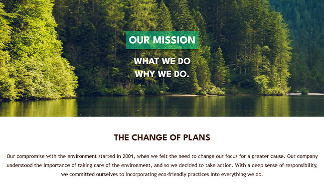
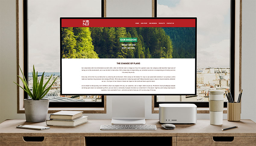
The mission page took a more informative role, giving users a deep understanding of the brand’s values and impact throughout the years. Written data and infographics were combined to effectively showcase the accomplishments of Dr. Nut, and direct links to charity pages affiliated with the brand were provided to encourage users to donate and explore other websites connected to Dr. Nut’s objective.
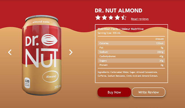
The products page was mainly an interactive section that displayed a variety of information about the beverages sold by the company. Each product contained ratings, reviews, nutritional facts and a direct link to their purchase page. As the user slides through the different products available, their corresponding information displayed accordingly, allowing users to quickly find the items they are looking for.
The result of this project was a well-received website and design guidelines document that met the client’s expectations. The brand was given a modern look but retained the essence of its previous design. The website was fully responsive and free of errors or bugs across all browsers. Interactive elements like the product slider were successfully implemented as well.
Return to Home Page